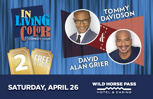
Direct Mail creative for Wild Horse Pass. The account team supplied the copy and (only) the 2 images of the guests. There was a stipulation that both guests had to be shown equally and one couldn't over take the other.
I'm excited to show this collateral because when it comes to social media I only update my production, automotive or illustration work. When I created the logo for this promo I felt that it properly portrayed me as a designer. It also helped that I grew up on watching In Living Color. I recreated the "In Living Color" logo and went very mid-century with the treatment for Tommy and David. These classy guys deserved a classy look.
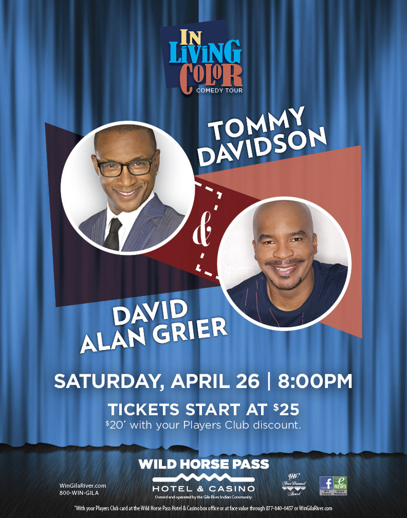
Once the direct mail piece was approved then it was time for COLLATERAL! One of my favorite words.
The pieces coming up are pretty much resizes but they require strong knowledge of print & digital/web.
The pieces coming up are pretty much resizes but they require strong knowledge of print & digital/web.
Knowleged that comes in handy if you're like me and expected to also produce final, vendore-ready files.
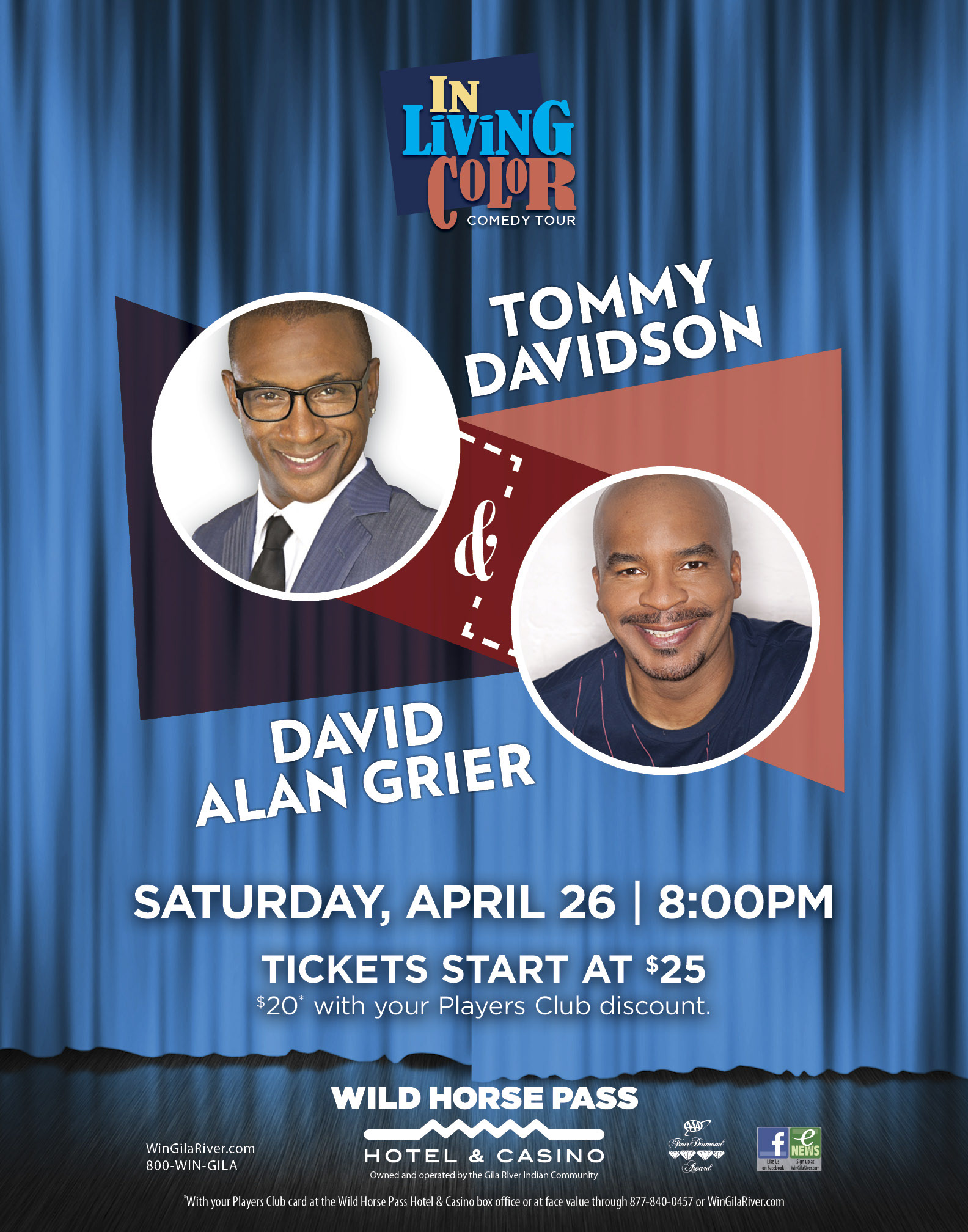
The piece below is the poster which was also re-sized into an 11x14 flyer and a rack card (not pictured).
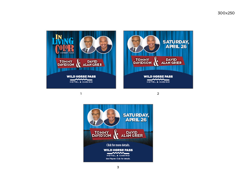
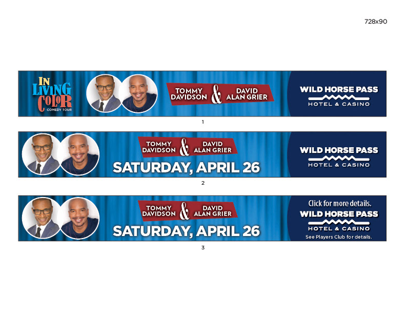
The next 3 pages are Flash storyboards. These type of resizes are challenging in that they require quick-problem solving. So, I just let the framing evolve.
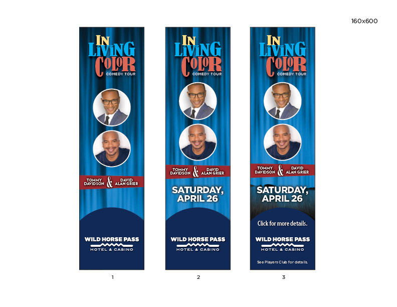
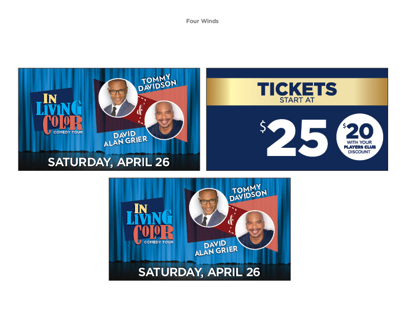
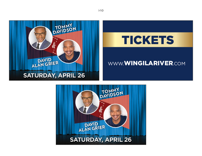
The next few pages wrap-up the collateral and are used for digiatl displays and digital video displays.

And that is just a part of my day-to-day. Thank you for your time and let me know if you have any questions.